Kay's Wireframes
Desktop Wireframe

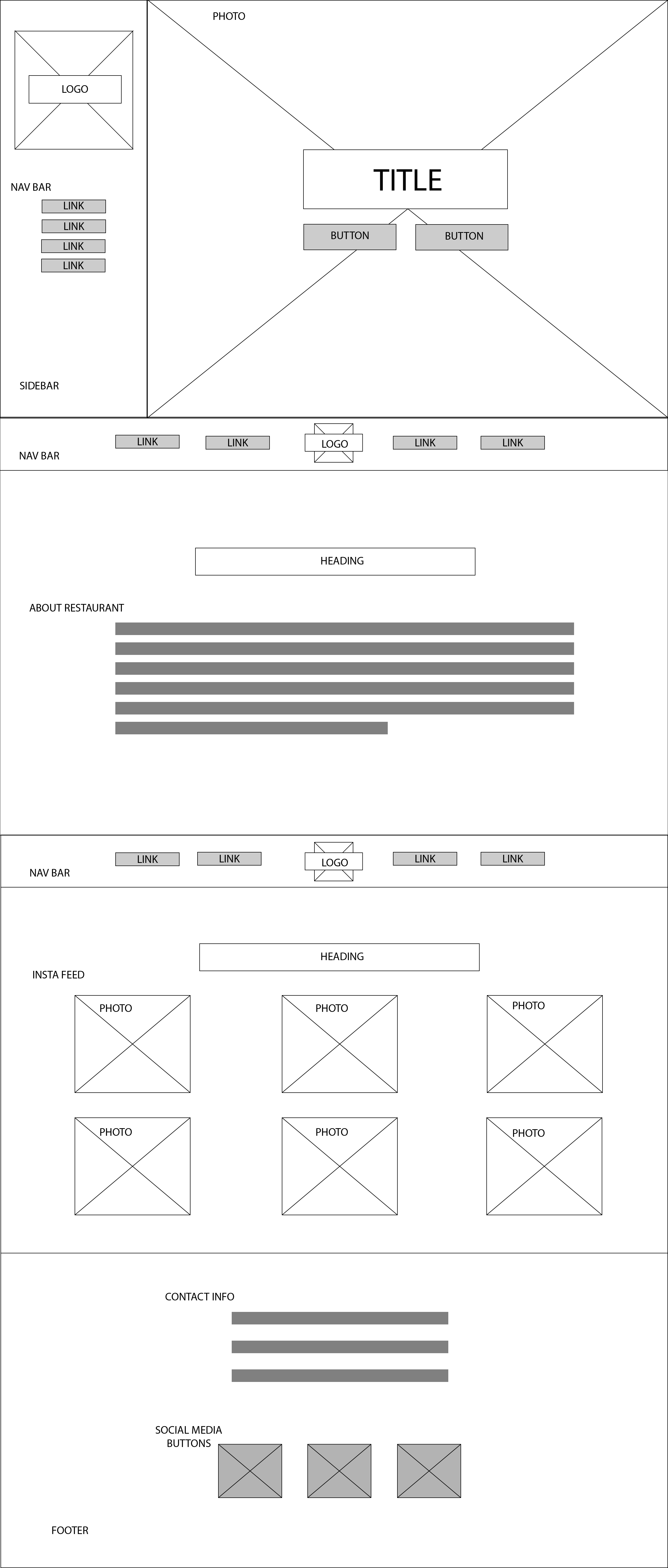
For the fonts, I will use sans serif for a modern clean look. I will use make the headings and title a bolder weight and all caps to add contrast between the body copy and the headings. For the colours, I will use a greyscale, with the accent colour of light blue for a sleek look. The "buttons" I will have them with a background grey at first but on hover they will change to the light blue. For the nav bar, I will have the background colour a dark grey. Also, for the section with the about restaurant and the instagram feed the background will be a light grey. For the footer and sidebar, the background colour will be a darker grey. For the large image, the picture will be a wooden table top, with a white plate in the left bottom corner to show an "eclectic" but modern feel. For the logo, I envision it to be a nice line drawing like seen here. For the instagram photos, these will be directly from the restaurants insta feed, which will show the general dishes served and the restaurant atmosphere/dining area. In the footer, there will be the logos of 3 different social media platforms (twitter, facebook, instagram) that will be in grey. As well, the side bar will turn into the static header on scroll as seen in the desktop wireframe.
Mobile Wireframe
